[Flutter] 다양한 버튼 사용하기
Yeony (Nayeon Kim) · 2022-10-07
Flutter Buttons 사용하기
플러터는 다양한 버튼을 위젯으로 제공합니다.
import 'package:flutter/material.dart';

void main() {
  runApp(MyApp());
}

class MyApp extends StatelessWidget {

  @override
  Widget build(BuildContext context) {
    return MaterialApp(
      debugShowCheckedModeBanner: false,
      title: 'MaterialApp',
      home: Scaffold(
          appBar: AppBar(
            title: Text('Flutter Buttons'),
            centerTitle: true,
          ),
          body: Center(
            child: Column(
              mainAxisAlignment: MainAxisAlignment.spaceEvenly,
              children: <Widget>[
                // Write your Buttons!
              ],
            ),
          )),
    );
  }
}
이 코드를 기본으로 두고 시작해봅시다.
TextButton
TextButton은 이름 그대로 버튼으로 동작하는 텍스트입니다.
테두리가 보이지 않아, 주의해서 배치해야합니다.
TextButton은 이렇게 구성됩니다.
const TextButton({
  Key? key,
  required void Function()? onPressed,
  void Function()? onLongPress,
  void Function(bool)? onHover,
  void Function(bool)? onFocusChange,
  ButtonStyle? style,
  FocusNode? focusNode,
  bool autofocus = false,
  Clip clipBehavior = Clip.none,
  required Widget child,
})
예시를 살펴봅시다.
 body: Center(
  child: Column(
    mainAxisAlignment: MainAxisAlignment.spaceEvenly,
    children: <Widget>[
      TextButton(
        style: TextButton.styleFrom(
          textStyle: const TextStyle(fontSize: 20),
        ),
        onPressed: null,
        child: const Text('Disabled'),
      ),
      TextButton(
        style: TextButton.styleFrom(
          textStyle: const TextStyle(fontSize: 20),
        ),
        onPressed: () {},
        child: const Text('Click Me!'),
      ),
      TextButton(
        style: TextButton.styleFrom(
          backgroundColor: Colors.amber,
          primary: Colors.white,
          textStyle: const TextStyle(fontSize: 20),
        ),
        onPressed: () {},
        child: const Text('Set primary!'),
      ),
    ],
  ),
)
화면에는 이렇게 보여집니다.
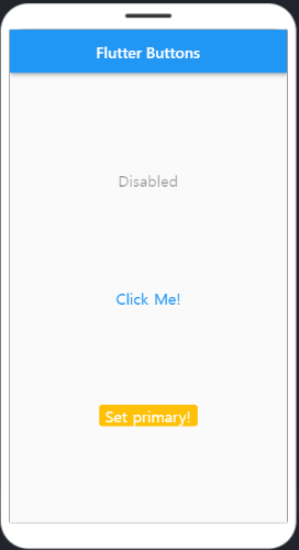
TextButton에서 글자색상을 변경할 경우에는 TextButton.styleFrom에서 primary 속성을 지정해 변경할 수 있습니다.
보다 자세한 색상 변경에 관해서는 Changing Text Button Color in Flutter – The Right Way in 2022 를 참고해주세요.
ElevatedButton
ElevatedButton은 오른쪽과 아래쪽으로 그림자가 생겨 버튼이 주변과 구분됩니다.
이렇게 구성됩니다.
const ElevatedButton({
  Key? key,
  required VoidCallback? onPressed,
  VoidCallback? onLongPress,
  ValueChanged<bool>? onHover,
  ValueChanged<bool>? onFocusChange,
  ButtonStyle? style,
  FocusNode? focusNode,
  bool autofocus = false,
  Clip clipBehavior = Clip.none,
  required Widget? child,
})
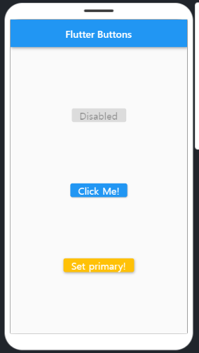
예제는 TextButton과 큰 차이가 없습니다. 다만 명확하게 border가 있어 구분됩니다.
 body: Center(
  child: Column(
    mainAxisAlignment: MainAxisAlignment.spaceEvenly,
    children: <Widget>[
      ElevatedButton(
        style: TextButton.styleFrom(
          textStyle: const TextStyle(fontSize: 20),
        ),
        onPressed: null,
        child: const Text('Disabled'),
      ),
      ElevatedButton(
        style: TextButton.styleFrom(
          textStyle: const TextStyle(fontSize: 20),
        ),
        onPressed: () {},
        child: const Text('Click Me!'),
      ),
      ElevatedButton(
        style: ElevatedButton.styleFrom(
          primary: Colors.amber,
          textStyle: const TextStyle(fontSize: 20),
        ),
        onPressed: () {},
        child: const Text('Set primary!'),
      ),
    ],
  ),
)
ElevatedButton.styleFfrom 으로 스타일을 지정합니다. TextButton과 다르게 primary를 지정하면 배경색이 바뀝니다.
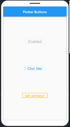
OutlinedButton
이름 그대로 테두리가 있는 버튼입니다.
const OutlinedButton({
  Key? key,
  required VoidCallback? onPressed,
  VoidCallback? onLongPress,
  ValueChanged<bool>? onHover,
  ValueChanged<bool>? onFocusChange,
  ButtonStyle? style,
  FocusNode? focusNode,
  bool autofocus = false,
  Clip clipBehavior = Clip.none,
  required Widget child,
})
앞선 버튼들과 크게 다르지 않지만, 테두리 색상이 기본적으로 회색으로 지정되어 있습니다.
side: BorderSide(widht: 2.0, color: Colors.amber) 등으로 속성을 지정하면 테두리 색깔을 바꿀 수 있습니다.
 body: Center(
    child: Column(
      mainAxisAlignment: MainAxisAlignment.spaceEvenly,
      children: <Widget>[
        OutlinedButton(
          style: OutlinedButton.styleFrom(
            textStyle: const TextStyle(fontSize: 20),
          ),
          onPressed: null,
          child: const Text('Disabled'),
        ),
        OutlinedButton(
          style: OutlinedButton.styleFrom(
            textStyle: const TextStyle(fontSize: 20),
          ),
          onPressed: () {},
          child: const Text('Click Me!'),
        ),
        OutlinedButton(
          style: OutlinedButton.styleFrom(
            primary: Colors.amber,
            // Border Style 변경
            side: BorderSide(width: 2.0, color: Colors.amber),
            textStyle: const TextStyle(fontSize: 20),
          ),
          onPressed: () {},
          child: const Text('Set primary!'),
        ),
      ],
    ),
  )
),
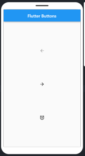
IconButton
아이콘으로 버튼을 만들 수 있습니다.
const IconButton({
  Key? key,
  this.iconSize,
  this.visualDensity,
  this.padding = const EdgeInsets.all(8.0),
  this.alignment = Alignment.center,
  this.splashRadius,
  this.color,
  this.focusColor,
  this.hoverColor,
  this.highlightColor,
  this.splashColor,
  this.disabledColor,
  required this.onPressed,
  this.mouseCursor,
  this.focusNode,
  this.autofocus = false,
  this.tooltip,
  this.enableFeedback = true,
  this.constraints,
  required this.icon,
})
body: Center(
  child: Column(
    mainAxisAlignment: MainAxisAlignment.spaceEvenly,
    children: <Widget>[
      IconButton(
        icon: const Icon(Icons.arrow_back),
        onPressed: null,
      ),
      IconButton(
        icon: const Icon(Icons.arrow_forward),
        onPressed: () {},
      ),
      IconButton(
        icon: const Icon(Icons.alarm_add),
        onPressed: () {},
      ),
    ],
  ),
)
FloatingActionButton
FloatingActionButton은 둥둥 떠있는 버튼입니다.
이 버튼을 사용하기 위해서는 Scaffold 위젯에 floatingActionButton 속성을 추가해야 합니다.
Scaffold(
  floatingActionButton: FloatingActionButton(),
),
이렇게 아이콘을 지정할 수 있습니다.
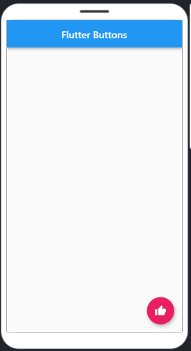
floatingActionButton: FloatingActionButton(
  onPressed: () {},
  child: const Icon(Icons.thumb_up),
  backgroundColor: Colors.pink,
),
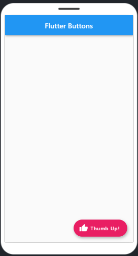
만약 버튼에 label을 넣고 싶다면, FloatingActionButton.extended를 이용해 작성합니다.
floatingActionButton: FloatingActionButton.extended(
  onPressed: () {},
  icon: Icon(Icons.thumb_up),
  label: Text('Thumb Up!'),
  backgroundColor: Colors.pink,
),
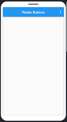
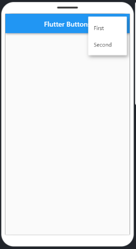
PopupMenuButton
이 버튼을 사용하려면 Scaffold의 AppBar 위젯에 actions 속성을 추가합니다.
Scaffold(
  appBar: AppBar(
    title: Text('Flutter Buttons'),
    centerTitle: true,
    actions: [
      PopupMenuButton(
          itemBuilder: (context) => [
                PopupMenuItem(
                  child: Text("First"),
                  value: 1,
                ),
                PopupMenuItem(
                  child: Text("Second"),
                  value: 2,
                )
              ])
    ],
  ),
)
DropdownButton
web의 select 기능을 하는 버튼입니다. Dropdown을 사용하기 위해서는 먼저 StatefulWidget으로 변경합니다.
DropdownButton({
  Key key,
  @required List<DropdownMenuItem<T>> items,
  DropdownButtonBuilder selectedItemBuilder,
  T value,
  Widget hint,
  Widget disabledHint,
  @required ValueChanged<T> onChanged,
  VoidCallback onTap,
  int elevation: 8,
  TextStyle style,
  Widget underline,
  Widget icon,
  Color iconDisabledColor,
  Color iconEnabledColor,
  double iconSize: 24.0,
  bool isDense: false,
  bool isExpanded: false,
  double itemHeight: kMinInteractiveDimension,
  Color focusColor,
  FocusNode focusNode,
  bool autofocus: false,
  Color dropdownColor
})
StatefulWidget으로 바꾸는 이유는 DropdownButton으로 선택된 값이라는 상태 변화가 있기 때문입니다.
Stateless에서도 DropdownButton을 그릴 수는 있지만, setState를 사용하지 못하기 때문에 의미가 없습니다.
import 'package:flutter/material.dart';

void main() {
  runApp(const MyApp());
}

class MyApp extends StatelessWidget {
  const MyApp({Key? key}) : super(key: key);
  @override
  Widget build(BuildContext context) {
    return MaterialApp(
      debugShowCheckedModeBanner: false,
      title: 'MaterialApp',
      home: const MyHomePage(),
    );
  }
}

class MyHomePage extends StatefulWidget {
  const MyHomePage({Key? key}) : super(key: key);

  @override
  _MyHomePageState createState() => _MyHomePageState();
}

class _MyHomePageState extends State<MyHomePage> {
// Initial Selected Value
  String dropdownvalue = 'Item 1';

// List of items in our dropdown menu
  var items = [
    'Item 1',
    'Item 2',
    'Item 3',
    'Item 4',
    'Item 5',
  ];
  @override
  Widget build(BuildContext context) {
    return Scaffold(
      appBar: AppBar(
        title: Text('Flutter Buttons'),
        centerTitle: true,
      ),
      body: Center(
        child: Column(
          mainAxisAlignment: MainAxisAlignment.center,
          children: [
            DropdownButton(
              // Initial Value
              value: dropdownvalue,

              // Down Arrow Icon
              icon: const Icon(Icons.keyboard_arrow_down),

              // Array list of items
              items: items.map((String items) {
                return DropdownMenuItem(
                  value: items,
                  child: Text(items),
                );
              }).toList(),
              // After selecting the desired option,it will
              // change button value to selected value
              onChanged: (String? newValue) {
                setState(() {
                  dropdownvalue = newValue!;
                });
              },
            ),
          ],
        ),
      ),
    );
  }
}
onPressed null or () {}
버튼에서는 onPressed 라는 클릭 이벤트를 정의할 수 있습니다.
위의 예제에서는 onPressed를 null로 두는 경우와, () {} 로 두는 경우가 있었습니다.
- null : disabled
- () {} : 클릭시 실행될 함수를 정의하지 않은 것
이러한 차이가 있습니다.
◾ [Flutter] 다양한 위젯 사용하기 👈 이전 글 보기
◾ [Flutter] Form, Alert에 사용할 수 있는 플러터 컴포넌트 👈 다음 글 보기