[Flutter] Form, Alert에 사용할 수 있는 플러터 컴포넌트
Yeony (Nayeon Kim) · 2022-10-14
플러터의 위젯들을 많이 살펴봤는데요. 이 글에서는 알람과 다이얼로그, 폼과 같이 입력할 수 있는 컴포넌트 위젯에 대해 알아보고자 합니다.
Dialogs, Alerts, Panels
먼저 다이얼로그와 Alert부터 살펴보겠습니다.
import 'package:flutter/material.dart';

void main() {
  runApp(MyApp());
}

class MyApp extends StatelessWidget {
  @override
  Widget build(BuildContext context) {
    return MaterialApp(
      title: "MaterialApp",
      home: TestDialog(),
    );
  }
}

class TestDialog extends StatelessWidget {
  @override
  Widget build(BuildContext context) {
    return Scaffold(
      appBar: AppBar(title: Text("Flutter Dialogs")),
      body: Container(
        child: Center(

        ),
      ),
    );
  }
}
여기서부터 시작해봅시다. context를 가져오기 위해 MyApp에서 분리했습니다.
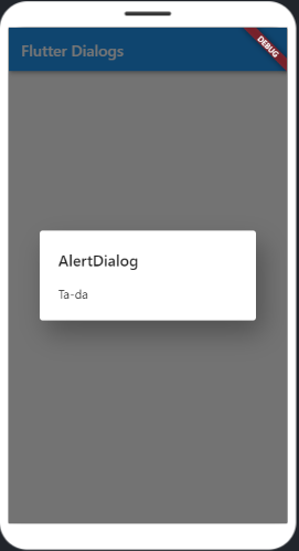
AlertDialog
사용자에게 경고나 알림을 주기 위해 사용합니다.
AlertDialog는 이러한 설정이 가능합니다.
const AlertDialog({
  Key? key,
  this.title,
  this.titlePadding,
  this.titleTextStyle,
  this.content,
  this.contentPadding = const EdgeInsets.fromLTRB(24.0, 20.0, 24.0, 24.0),
  this.contentTextStyle,
  this.actions,
  this.actionsPadding = EdgeInsets.zero,
  this.actionsAlignment,
  this.actionsOverflowDirection,
  this.actionsOverflowButtonSpacing,
  this.buttonPadding,
  this.backgroundColor,
  this.elevation,
  this.semanticLabel,
  this.insetPadding = _defaultInsetPadding,
  this.clipBehavior = Clip.none,
  this.shape,
  this.alignment,
  this.scrollable = false,
})
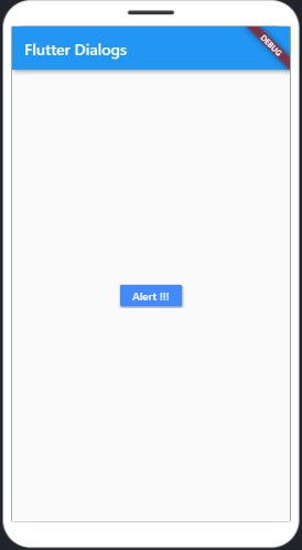
사용 예시입니다.
import 'package:flutter/material.dart';

void main() {
  runApp(MyApp());
}

class MyApp extends StatelessWidget {
  @override
  Widget build(BuildContext context) {
    return MaterialApp(
      title: "MaterialApp",
      home: TestDialog(),
    );
  }
}

class TestDialog extends StatelessWidget {
  @override
  Widget build(BuildContext context) {
    return Scaffold(
      appBar: AppBar(title: Text("Flutter Dialogs")),
      body: Container(
        child: Center(
          child: RaisedButton(
            color: Colors.blueAccent,
            textColor: Colors.white,
            onPressed: () {
              testAlert(context);
            },
            child: Text("Alert !!!"),
          ),
        ),
      ),
    );
  }

  void testAlert(BuildContext context) {
    var alert = AlertDialog(
      title: Text("AlertDialog"),
      content: Text("Ta-da"),
    );

    showDialog(
        context: context,
        builder: (BuildContext context) {
          return alert;
        });
  }
}
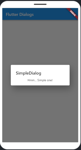
SimpleDialog
AlertDialog와 유사하지만, 이름 그대로 매개변수가 좀더 적고 간단합니다.
AlertDialog에는 content를 작성했는데, SimpleDialog에서는 내용을 적을 때 children에 적어주어야 합니다.
const SimpleDialog({
  Key? key,
  this.title,
  this.titlePadding = const EdgeInsets.fromLTRB(24.0, 24.0, 24.0, 0.0),
  this.titleTextStyle,
  this.children,
  this.contentPadding = const EdgeInsets.fromLTRB(0.0, 12.0, 0.0, 16.0),
  this.backgroundColor,
  this.elevation,
  this.semanticLabel,
  this.insetPadding = _defaultInsetPadding,
  this.clipBehavior = Clip.none,
  this.shape,
  this.alignment,
})
코드 작성은 AlertDialog와 크게 다르지 않습니다.
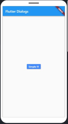
AlertDialog의 testAlert 부분에서 SimpleDialog로 바꿔줍니다. content 대신 children을 작성합니다.
void testAlert(BuildContext context) {
    var alert = SimpleDialog(
      title: Text("AlertDialog"),
      children: [
        Center(
          child: Text('Hmm... Simple one!'),
        )
      ],
    );

    showDialog(
        context: context,
        builder: (BuildContext context) {
          return alert;
        });
  }
SnackBar
SnackBar는 팝업 메시지를 일시적으로 표시할 수 있는 위젯입니다. 보통 앱 하단에 띄우는 경우가 많습니다.
예를 들자면 장바구니 추가 알림 같은 (경고보다는 중요도가 떨어지는) 알람을 사용할 때 쓰는 것 같습니다.
SnackBar는 이런 설정이 가능합니다.
const SnackBar({
  Key? key,
  required this.content,
  this.backgroundColor,
  this.elevation,
  this.margin,
  this.padding,
  this.width,
  this.shape,
  this.behavior,
  this.action,
  this.duration = _snackBarDisplayDuration,
  this.animation,
  this.onVisible,
  this.dismissDirection = DismissDirection.down,
})
SnackBar를 사용하기 위해 위젯을 변경했습니다.
import 'package:flutter/material.dart';

void main() {
  runApp(MyApp());
}

class MyApp extends StatelessWidget {
  @override
  Widget build(BuildContext context) {
    return MaterialApp(
      title: "MaterialApp",
      // SnackBarPage로 설정
      home: SnackBarPage(),
    );
  }
}

// SnackBarPage class 생성
class SnackBarPage extends StatelessWidget {
  const SnackBarPage({Key? key}) : super(key: key);

  @override
  Widget build(BuildContext context) {
    return Scaffold(
        appBar: AppBar(
          title: Text('Flutter SnackBar'),
          centerTitle: true
        ),
        body: Center(
          child: ElevatedButton(
            onPressed: () {
              final snackBar = SnackBar(
                content: const Text('Hi, I am a SnackBar!'),
                backgroundColor: (Colors.black12),
                action: SnackBarAction(
                  label: 'dismiss',
                  onPressed: () {},
                ),
              );
              ScaffoldMessenger.of(context).showSnackBar(snackBar);
            },
            child: const Text(
              'Click to Display a SnackBar',
            ),
          ),
        ));
  }
}
ElevatedButton의 onPressed에 SnackBar를 호출하도록 작성했습니다. 아래와 같은 결과가 나옵니다.
ExpansionPanel
ExpansionPanel은 저에게는 아코디언 같은 이름으로 좀더 익숙한 위젯입니다. 펼쳐보기 + 접기가 가능합니다.
ExpansionPanelList와 함께 사용합니다. state가 필요해 ExpansionPanelDemo를 StatefulWidget으로 작성했습니다.
import 'package:flutter/material.dart';

void main() {
  runApp(MyApp());
}

class MyApp extends StatelessWidget {
  @override
  Widget build(BuildContext context) {
    return MaterialApp(
      title: 'Flutter Demo',
      home: ExpansionPanelDemo(),
    );
  }
}

class ExpansionPanelDemo extends StatefulWidget {
  ExpansionPanelDemo({Key? key}) : super(key: key);

  @override
  _ExpansionPanelDemoState createState() => _ExpansionPanelDemoState();
}

class _ExpansionPanelDemoState extends State<ExpansionPanelDemo> {
  List<Item> _items = generateItems(8);

  @override
  Widget build(BuildContext context) {
    return Scaffold(
      appBar: AppBar(
        title: Text('Flutter ExpansionPanel'),
        centerTitle: true
      ),

      // 펼쳤을 때 화면을 넘어갈 수 있으므로 ScrollView로 처리합니다.
      body: SingleChildScrollView(
        child: Container(
          padding: EdgeInsets.only(top: 80),
          child: _buildPanel(),
        ),
      ),
    );
  }

  Widget _buildPanel() {
    return ExpansionPanelList(
      expansionCallback: (int index, bool isExpanded) {
        setState(() {
          _items[index].isExpanded = !isExpanded;
        });
      },
      children: _items.map<ExpansionPanel>((Item item) {
        return ExpansionPanel(
          headerBuilder: (BuildContext context, bool isExpanded) {
            return ListTile(
              title: Text(item.headerValue),
            );
          },
          body: ListTile(
            title: Text(item.expandedValue),
          ),
          isExpanded: item.isExpanded,
        );
      }).toList(),
    );
  }
}

// ExpansionPanel state 정보를 저장합니다.
class Item {
  Item({
    required this.expandedValue,
    required this.headerValue,
    this.isExpanded = false,
  });

  String expandedValue;
  String headerValue;
  bool isExpanded;
}

List<Item> generateItems(int numberOfItems) {
  return List.generate(numberOfItems, (int index) {
    return Item(
      headerValue: 'Item ${index + 1}',
      expandedValue: 'Item ${index + 1} Detail',
    );
  });
}
BottomSheet
하단에서 올라오는 시트 위젯입니다.
import 'package:flutter/material.dart';

void main() => runApp(new MyApp());

class MyApp extends StatelessWidget {
  @override
  Widget build(BuildContext context) {
    return new MaterialApp(
      title: 'Flutter Demo',
      theme: new ThemeData(
        primarySwatch: Colors.blue,
      ),
      home: new BottomSheetPage(),
    );
  }
}

class BottomSheetPage extends StatefulWidget {
  BottomSheetPage({Key? key}) : super(key: key);

  @override
  _BottomSheetPageState createState() => new _BottomSheetPageState();
}

class _BottomSheetPageState extends State<BottomSheetPage> {
  @override
  Widget build(BuildContext context) {
    return new Scaffold(
      appBar: new AppBar(
        title: new Text('Flutter BottomSheet'),
      ),
      floatingActionButton: new FloatingActionButton(
        onPressed: () {
          _settingModalBottomSheet(context);
        },
        child: new Icon(Icons.add),
      ),
    );
  }
}

void _settingModalBottomSheet(context) {
  showModalBottomSheet(
      context: context,
      builder: (BuildContext bc) {
        return Container(
          child: new Wrap(
            children: <Widget>[
              new ListTile(
                  leading: new Icon(Icons.music_note),
                  title: new Text('Music'),
                  onTap: () => {}),
              new ListTile(
                leading: new Icon(Icons.videocam),
                title: new Text('Video'),
                onTap: () => {},
              ),
            ],
          ),
        );
      });
}
Input & Selections
다음은 흔히 Form을 만들 때 사용할 수 있는 컴포넌트 위젯들을 살펴보겠습니다.
import 'package:flutter/material.dart';

void main() {
  runApp(MaterialApp(
    home: InputSelectionPage(),
  ));
}

class InputSelectionPage extends StatefulWidget {
  @override
  _InputSelectionPageState createState() => _InputSelectionPageState();
}

class _InputSelectionPageState extends State<InputSelectionPage> {

  @override
  Widget build(BuildContext context) {
    return MaterialApp(
      home: Scaffold(
          appBar: AppBar(
            title: Text('Flutter Input & Selection'),
          ),
          body: Column(
            children: <Widget>[

            ],
          )),
    );
  }
}
여기서부터 시작해보겠습니다. 기본 코드에 계속 input 요소들을 추가 해볼겁니다.
Checkbox
웹에서도 볼 수 있는 checkbox입니다. Input & Selection 부분은 웹과 동일한 부분이 많아 익숙하게 느껴졌습니다.
Checkbox는 bool 타입으로 작동합니다. 체크되었냐 or 체크되지 않았냐 두 가지의 상태입니다.
class _InputSelectionPageState extends State<InputSelectionPage> {

  // state 설정
  bool? valuefirst = false;
  bool? valuesecond = false;

  @override
  Widget build(BuildContext context) {
    return MaterialApp(
      home: Scaffold(
          appBar: AppBar(
            title: Text('Flutter Input & Selection'),
          ),
          body: Column(
            children: <Widget>[
              Row(
                children: <Widget>[
                  SizedBox(
                    width: 10,
                  ),
                  Text(
                    'Checkbox ',
                    style: TextStyle(fontSize: 17.0),
                  ),
                  Checkbox(
                    checkColor: Colors.greenAccent,
                    activeColor: Colors.red,
                    value: this.valuefirst,
                    onChanged: (bool? value) {
                      setState(() {
                        this.valuefirst = value;
                      });
                    },
                  ),
                  Checkbox(
                    value: this.valuesecond,
                    onChanged: (bool? value) {
                      setState(() {
                        this.valuesecond = value;
                      });
                    },
                  ),
                ],
              ),
            ],
          )),
    );
  }
}
Date & Time Pickers
날짜와 시간 선택이 가능한 위젯입니다. showDatePicker를 사용합니다.
먼저 날짜를 선택했을 때 바뀔 state를 위해 selectedDate를 하나 선언 할당합니다.
자바스크립트에서는 promise에 해당하는 Future가 있습니다. 비동기처리로 selectedDate를 컨트롤합니다.
class _InputSelectionPageState extends State<InputSelectionPage> {
  bool? valuefirst = false;
  bool? valuesecond = false;

  // DateTime 타입으로 selectedDate를 설정합니다.
  DateTime selectedDate = DateTime.now();


  // 비동기 처리
  Future<void> _selectDate(BuildContext context) async {
    final DateTime? picked = await showDatePicker(
        context: context,
        initialDate: selectedDate, // 첫 세팅을 selecteDate로
        firstDate: DateTime(2015, 8), // 2015년도 8월부터 선택 가능
        lastDate: DateTime(2025)); // 2025년도까지 선택 가능

    // picked가 null이 아니고 첫 값이랑 똑같지 않으면 selectedDate를 picked로 치환.
    if (picked != null && picked != selectedDate) {
      setState(() {
        selectedDate = picked;
      });
    }
  }

  //...
}
Column의 children 속에 Row를 하나 더 작성해 picker를 열고, 선택된 날짜를 보여주도록 작성합니다.
Row(
  children: <Widget>[
    SizedBox(
      width: 10,
    ),
    Text(
      'Date picker ',
      style: TextStyle(fontSize: 17.0),
    ),
    SizedBox(
      height: 20.0,
    ),
    RaisedButton(
      // 비동기 처리한 _selectDate 호출
      onPressed: () => _selectDate(context),
      child: Text('Select date'),
    ),
    SizedBox(
      width: 20.0,
    ),
    Text("${selectedDate.toLocal()}".split(' ')[0]),
  ],
),
Radio
여러 선택지 중 하나를 고를 수 있게 하는 위젯입니다.
성별로 선택지를 만들어보겠습니다.
먼저 enum Gender 를 클래스 밖에 만들어줍니다.
enum Gender { female, male }
그리고 state를 만들어줍니다.
class _InputSelectionPageState extends State<InputSelectionPage> {
  //...

  // 기본값을 female로 세팅
  Gender? _gender = Gender.female;

  //...
}
마지막으로 Row를 하나 더 추가합니다.
Row(
  children: <Widget>[
    SizedBox(
      width: 10,
    ),
    Text(
      'Radio ',
      style: TextStyle(fontSize: 17.0),
    ),
    SizedBox(
      width: 10,
    ),
    Text(
      'Female ',
      style: TextStyle(fontSize: 17.0),
    ),
    Radio<Gender>(
      value: Gender.female,
      groupValue: _gender,
      onChanged: (Gender? value) {
        setState(() {
          _gender = value;
        });
      },
    ),
    Text(
      'Male ',
      style: TextStyle(fontSize: 17.0),
    ),
    Radio<Gender>(
      value: Gender.male,
      groupValue: _gender,
      onChanged: (Gender? value) {
        setState(() {
          _gender = value;
        });
      },
    )
  ],
),
Slider
보통 음량 조절 할때 많이 볼 수 있는 Slider입니다.
state를 하나 만들어줍니다.
Slider의 min값은 0이고, max 값은 1입니다.
class _InputSelectionPageState extends State<InputSelectionPage> {
  //...

  // 기본값을 0.0으로 세팅
  double _volumn = 0.0;

  //...
}
그리고 Row를 하나 더 만듭니다.
Row(
  children: <Widget>[
    SizedBox(
      width: 10,
    ),
    Text(
      'Slider ',
      style: TextStyle(fontSize: 17.0),
    ),
    Slider(
      value: _volumn,
      onChanged: (value) {
        setState(() {
          _volumn = value;
        });
      },
    ),
    Text("${(_volumn * 100).toStringAsFixed(2)}"),
  ],
),
0부터 1까지의 값이 아닌, 1부터 100까지를 보여주고 싶어 toStringAsFixed를 이용했습니다.
Switch
저는 흔히 토글이라고 불러온 버튼입니다. 참/거짓 2가지의 값만 가질 수 있습니다.
class _InputSelectionPageState extends State<InputSelectionPage> {
  //...

  // 기본값을 false로 세팅
  bool isSwitched = false;

  //...
}
Row를 또 작성해봅시다.
Row(
  children: <Widget>[
    SizedBox(width: 10),
    Text(
      'Switch ',
      style: TextStyle(fontSize: 17.0),
    ),
    Switch(
      value: isSwitched,
      onChanged: (value) {
        setState(() {
          isSwitched = value;
        });
      },
      activeTrackColor: Colors.lightBlueAccent,
      activeColor: Colors.blue,
    ),
  ],
)
TextField
html에서 볼 수 있는 <input type="text">와 같은 문자 입력 위젯입니다.
문자를 입력할 때마다 바뀌도록, state와 TextEditingController를 추가합니다.
class _InputSelectionPageState extends State<InputSelectionPage> {
  //...

  TextEditingController nameController = TextEditingController();
  String _anyText = '';

  //...
}
TextField를 사용할 때에는 너비가 지정된 상태로 사용해야 합니다.
Row 밑에 그냥 넣었다가 에러가 발생했습니다.
따라서 우리는 SizedBox에다가 TextField를 넣어줍시다.
Row(
  children: <Widget>[
    SizedBox(width: 10),
    Text(
      'TextField ',
      style: TextStyle(fontSize: 17.0),
    ),
    SizedBox(
        width: 150,
        child: TextField(
          controller: nameController,
          onChanged: (text) {
            setState(() {
              _anyText = text;
            });
          },
        )),
    Text("${_anyText}"),
  ],
)
여기까지 완료하면 이렇게 만들어집니다.
전체 코드는 이렇습니다.
import 'package:flutter/material.dart';

void main() {
  runApp(MaterialApp(
    home: InputSelectionPage(),
  ));
}

class InputSelectionPage extends StatefulWidget {
  @override
  _InputSelectionPageState createState() => _InputSelectionPageState();
}

enum Gender { female, male }

class _InputSelectionPageState extends State<InputSelectionPage> {
  bool? valuefirst = false;
  bool? valuesecond = false;

  DateTime selectedDate = DateTime.now();
  Future<void> _selectDate(BuildContext context) async {
    final DateTime? picked = await showDatePicker(
        context: context,
        initialDate: selectedDate,
        firstDate: DateTime(2015, 8),
        lastDate: DateTime(2101));
    if (picked != null && picked != selectedDate) {
      setState(() {
        selectedDate = picked;
      });
    }
  }

  Gender? _gender = Gender.female;

  double _volumn = 0.0;

  bool isSwitched = false;

  TextEditingController nameController = TextEditingController();
  String _anyText = '';

  @override
  Widget build(BuildContext context) {
    return MaterialApp(
      home: Scaffold(
          appBar: AppBar(
            title: Text('Flutter Input & Selection'),
          ),
          body: Column(
            children: <Widget>[
              SizedBox(
                height: 30,
              ),
              Row(
                children: <Widget>[
                  SizedBox(
                    width: 10,
                  ),
                  Text(
                    'Checkbox ',
                    style: TextStyle(fontSize: 17.0),
                  ),
                  Checkbox(
                    checkColor: Colors.greenAccent,
                    activeColor: Colors.red,
                    value: this.valuefirst,
                    onChanged: (bool? value) {
                      setState(() {
                        this.valuefirst = value;
                      });
                    },
                  ),
                  Checkbox(
                    value: this.valuesecond,
                    onChanged: (bool? value) {
                      setState(() {
                        this.valuesecond = value;
                      });
                    },
                  ),
                ],
              ),
              Row(
                children: <Widget>[
                  SizedBox(
                    width: 10,
                  ),
                  Text(
                    'Date picker ',
                    style: TextStyle(fontSize: 17.0),
                  ),
                  SizedBox(
                    height: 20.0,
                  ),
                  RaisedButton(
                    onPressed: () => _selectDate(context),
                    child: Text('Select date'),
                  ),
                  SizedBox(
                    width: 20.0,
                  ),
                  Text("${selectedDate.toLocal()}".split(' ')[0]),
                ],
              ),
              Row(
                children: <Widget>[
                  SizedBox(
                    width: 10,
                  ),
                  Text(
                    'Radio ',
                    style: TextStyle(fontSize: 17.0),
                  ),
                  SizedBox(
                    width: 10,
                  ),
                  Text(
                    'Female ',
                    style: TextStyle(fontSize: 17.0),
                  ),
                  Radio<Gender>(
                    value: Gender.female,
                    groupValue: _gender,
                    onChanged: (Gender? value) {
                      setState(() {
                        _gender = value;
                      });
                    },
                  ),
                  Text(
                    'Male ',
                    style: TextStyle(fontSize: 17.0),
                  ),
                  Radio<Gender>(
                    value: Gender.male,
                    groupValue: _gender,
                    onChanged: (Gender? value) {
                      setState(() {
                        _gender = value;
                      });
                    },
                  )
                ],
              ),
              Row(
                children: <Widget>[
                  SizedBox(
                    width: 10,
                  ),
                  Text(
                    'Slider ',
                    style: TextStyle(fontSize: 17.0),
                  ),
                  Slider(
                    value: _volumn,
                    onChanged: (value) {
                      setState(() {
                        _volumn = value;
                      });
                    },
                  ),
                  Text("${(_volumn * 100).toStringAsFixed(2)}"),
                ],
              ),
              Row(
                children: <Widget>[
                  SizedBox(width: 10),
                  Text(
                    'Switch ',
                    style: TextStyle(fontSize: 17.0),
                  ),
                  Switch(
                    value: isSwitched,
                    onChanged: (value) {
                      setState(() {
                        isSwitched = value;
                      });
                    },
                    activeTrackColor: Colors.lightBlueAccent,
                    activeColor: Colors.blue,
                  ),
                ],
              ),
              Row(
                children: <Widget>[
                  SizedBox(width: 10),
                  Text(
                    'TextField ',
                    style: TextStyle(fontSize: 17.0),
                  ),
                  SizedBox(
                      width: 150,
                      child: TextField(
                        controller: nameController,
                        onChanged: (text) {
                          setState(() {
                            _anyText = text;
                          });
                        },
                      )),
                  Text("${_anyText}"),
                ],
              )
            ],
          )),
    );
  }
}
◾ [Flutter] 다양한 버튼 사용하기 👈 이전 글 보기
◾ [Flutter] CircularProgressIndicator와 Chip 사용해보기 👈 다음 글 보기