[Flutter] 다양한 위젯 사용하기
Yeony (Nayeon Kim) · 2022-09-30
Flutter 위젯 사용하기
import 'package:flutter/material.dart';

void main() {
  runApp(MyApp());
}

class MyApp extends StatelessWidget {
  // This widget is the root of your application.
  @override
  Widget build(BuildContext context) {
    return MaterialApp(
      home: Scaffold(
      ),
    );
  }
}
여기서부터 시작을 해봅시다.
MaterialApp
MaterialApp 클래스는 Material Design을 사용합니다.
머티리얼 디자인 은 대개 안드로이드 스마트폰에 적용되는 디자인입니다. 플러터에서는 머티리얼 디자인을 기반으로 동작하도록 여러 위젯을 래핑할 수 있는 MaterialApp을 제공합니다. 플러터 자체에서 이미 머티리얼 디자인이 구성되어 있어 별도의 개발이나 스타일링이 필요하지 않습니다.
title
간단한 앱의 한 줄 설명입니다. 안드로이드에서는 최근 사용한 앱에 표시되고, iOS에는 사용할 수 없습니다.
MaterialApp(
  title: '머티리얼 앱'
)
theme
말 그대로 앱의 테마를 지정할 수 있는 속성입니다.
MaterialApp(
  theme: ThemeData(
    // 전체 테마의 밝기
    // Brightness.light면 TextStyle이 기본으로 검정색
    // Brightness.dark면 기본으로 흰색
    brightness: Brightness.light,

    //앱바, 탭바 등의 색상 결정
    primaryColor: Colors.greenAccent,

    // 위젯의 강조색
    accentColor: Colors.redAccent,

    // 기본 사용 폰트 지정
    fontFamily: 'IBM-Sans'
  )
)
home
MaterialApp 기본 경로로, 앱 실행 시 가장 먼저 확인할 수 있는 화면입니다.
Scaffold 위젯을 사용해 정의합니다.
MaterialApp(
  home: Scaffold(

  )
)
여기까지는 Scaffold에 아무것도 작성하지 않았기 때문에, 흰색 화면만 보여집니다. Scaffold 클래스를 작성해봅시다.
Scaffold
Scaffold는 앱의 최상단, 중간, 최하단, floating 버튼을 지원하는 클래스입니다.
import 'package:flutter/material.dart';

void main() {
  runApp(MyApp());
}

class MyApp extends StatelessWidget {
  // This widget is the root of your application.
  @override
  Widget build(BuildContext context) {
    return MaterialApp(
      title: '머티리얼 앱',
      theme: ThemeData(
        brightness: Brightness.light,
        primaryColor: Colors.blue,
        accentColor: Colors.redAccent,
        fontFamily: 'IBM-Sans'
      ),
      home: Scaffold(
      ),
    );
  }
}
MaterialApp을 작성한 결과입니다. 이를 바탕으로 Scaffold를 작성해봅시다.
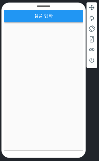
appBar
앱 최상단에 자리하며, 주로 현재 창의 이름을 표시할 때 사용됩니다.
Scaffold(
  appBar: AppBar(
    title: Text('샘플 앱바')
  )
),
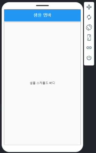
body
가운데 영역을 의미합니다.
Scaffold(
  body: Center(
    child: Text('샘플 스캐폴드 바디')
  )
),
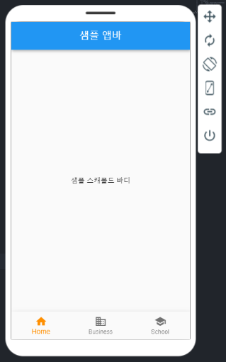
bottomNavigationBar
다른 창으로 이동할 수 있는 버튼들이 있는 영역입니다.
안드로이드에서는 Bottom Navigation Bar를 사용하고, iOS에서는 Tab Bar로 불리는 영역입니다.
Scaffold(
  bottomNavigationBar: BottomNavigationBar(
    items: const <BottomNavigationBarItem>[
      BottomNavigationBarItem(
        icon: Icon(Icons.home),
        label: 'Home',
      ),
      BottomNavigationBarItem(
        icon: Icon(Icons.business),
        label: 'Business',
      ),
      BottomNavigationBarItem(
        icon: Icon(Icons.school),
        label: 'School',
      ),
    ],
    selectedItemColor: Colors.amber[800],
  ),
),
bottomNavigationBar 속성에 bottomNavigationBar 클래스를 적고, items로 BottomNavigationBarItem의 리스트를 작성합니다.
import 'package:flutter/material.dart';

void main() {
  runApp(MyApp());
}

class MyApp extends StatelessWidget {
  // This widget is the root of your application.
  @override
  Widget build(BuildContext context) {
    return MaterialApp(
      title: '머티리얼 앱',
      theme: ThemeData(
        brightness: Brightness.light,
        primaryColor: Colors.blue,
        accentColor: Colors.redAccent,
        fontFamily: 'IBM-Sans'
      ),
      home: Scaffold(
        appBar: AppBar(
          title: Text('샘플 앱바')
        ),
        body: Center(
          child: Text('샘플 스캐폴드 바디')
        ),
        bottomNavigationBar: BottomNavigationBar(
          items: const <BottomNavigationBarItem>[
            BottomNavigationBarItem(
              icon: Icon(Icons.home),
              label: 'Home',
            ),
            BottomNavigationBarItem(
              icon: Icon(Icons.business),
              label: 'Business',
            ),
            BottomNavigationBarItem(
              icon: Icon(Icons.school),
              label: 'School',
            ),
          ],
          selectedItemColor: Colors.amber[800],
        ),
      ),
    );
  }
}
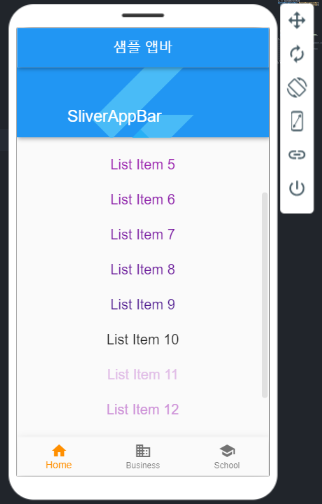
SliverAppBar
앱 스크롤에 따라 모양이 변하는 appBar 입니다.
CustomScrollView의 자식으로 사용됩니다. Sliver란 scrollable한 위젯들을 의미합니다.
위에서 만든 Scaffold의 body를 수정합니다.
Scaffold(
  body: CustomScrollView(
    slivers: [
      const SliverAppBar(
        floating: true,
        flexibleSpace: FlexibleSpaceBar(
          title: Text('SliverAppBar'),
          background: FlutterLogo(),
        ),
        expandedHeight: 200,
      ),
      SliverFixedExtentList(
        itemExtent: 50.0,
        delegate: SliverChildBuilderDelegate((BuildContext context, int index) {
          return Column(
            children: [
              Text(
                'List Item $index',
                style: TextStyle(
                    fontSize: 20,
                    color: Colors.purple[100 * (index % 10)]),
              ),
            ]);
        }, childCount: 15),
      ),
    ],
  )
)
SliverAppBar 속성
floating / pinned
floating: true 옵션을 주게 되면 SliverAppBar에 있는 title 부분이 스크롤할 때 사라져서 보이지 않게 됩니다.
pinned: true 속성을 주면 title 부분은 스크롤이 되더라도 고정되어 보이게 됩니다.
flexibleSpace
flexible하게 보여질 공간입니다. 스크롤 시 보여지지 않을 부분의 속성입니다.
여기서는 flutter logo를 배경으로 설정했습니다.
expandedHeight
스크롤이 되지 않았을 경우의 height를 설정합니다.
SliverFixedExtentList
Sliver 되는 appBar 밑으로 출력될 리스트입니다. ListView와 대응된다고 생각하면 됩니다.
SliverChildBuilderDelegate
SliverList는 child 목록으로 SliverChildBuilderDelegate 위젯을 이용합니다. childCount 속성으로 리스트의 개수를 컨트롤할 수 있습니다.
◾ [Flutter] Constraints 이해하기 👈 이전 글 보기 ◾ [Flutter] 다양한 버튼 사용하기 👈 다음 글 보기